
Eureka is a virtual classroom experience designed to create more organic spaces for students and teachers to interact.
Initial Product Video
Eureka started as a student team project. I created a product demo video to showcase the concept with an early prototype. You can check out our early designs in the video on the right!

Research Question
How might we foster connections between teachers and students in a higher education virtual classroom?
During virtual classroom sessions, teachers and instructors complain about a lack of feel and connection with their students. In the real world, classrooms are a place to make friends and encourage curiosity, but the virtual space can often feel cold and isolated.

Interviews with teachers and students to understand their challenges and needs during online class. From preschool to graduate programs to special needs, all of our interviewees had common issues with engagement, IT troubleshooting, and class management.
Conducting Interviews
(In-class) experiences help build trust, sharing, and the ability to articulate ideas in a multi-modal way. But now we have just this one flat experience. Now it’s just a zoom call and it’s always just a zoom call.
Getting used to Zoom was difficult. I would send people links for activities and printouts and even that was sometimes complicated. We don’t really have any IT support, we have to troubleshoot ourselves.
Individual projects feel very independent and I’m just doing things by myself. The lecture is not that interesting so I feel a bit isolated because there’s not a lot of engagement.
I’ve made cards because I’m tired of saying (unmute yourself) all the time. So I’ll just hold this (card) up and when they see it, they know they have to unmute. I also have cards for (turning on and off) video. Because when I screen share my video, if it’s a large group and they have their video on, it never works.

Building Personas

Buster is our instructor persona. Buster struggles with maintaining the energy level of virtual classrooms and lacks the tools to create a fun syllabus for his students. He wants to provide opportunities for the students to learn on their own, instead of sitting through lectures all day.

Morgan is our student persona. She feels isolated during class because there’s no interaction with other students. She gets bored easily during lectures and browses the web when she can’t focus on the lecture.
How can we help our users?
Based on user interviews, I created a list of 10 recommendations and charted them on a prioritization board.

Gathering Requirements
Fostering relationships through interaction
One on one interactions with students has dramatically decreased in online classrooms. Teachers and students need a quick interaction to facilitate more personal conversations without disrupting classroom flow.
Having a casual space to discuss and chat without the awkwardness of large online calls
Much of the relationship building of a classroom happens outside of lecture, side conversations between tablemates, or in the hallways as you walk to class. These physical spaces are intimate but are also public and easily accessible, and there is no immediate analog in digital class.
Being able to focus and switch views between a speaker, a large group, and a presentation
Classrooms are busy places with many different people interacting at once. Sometimes, it is necessary to focus on just one thing or person, but other times it is important to see the classroom as a whole.
Being easily accessible and intuitive to use regardless of technical background
Teachers are being asked to be both an instructor and an IT admin. Setting up breakout rooms, presentations, video and audio troubleshooting are all barriers that teachers face in the digital classroom.
Designs


Initial sketches of Eureka classroom interactions. The idea of Tables and a Communication Wheel are formed.

A brief layout of different views in Eureka. User testing revealed issues with navigation between the different views.
Early prototype of Tables. In this prototype, the Table and the Whiteboard are in separate spaces.

The Whiteboard view and the Table view were consolidated in order to streamline user navigation.

The feedback from our testing showed the Lecture view was too busy. Too many buttons, not sure where to look.


Feature Walkthrough

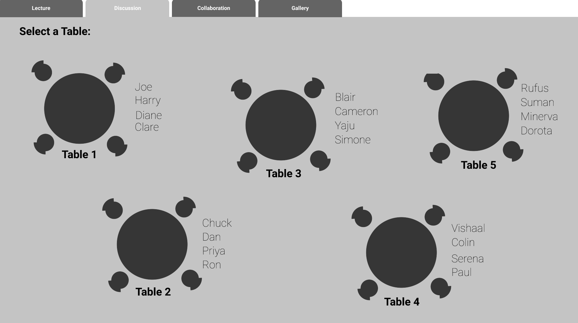
Tables
The Table is a space for students and teachers to collaborate.
Each table is an independent conference call and creates a more intimate space to share ideas.
Tables are accessed during a breakout session. When the instructor is ready, he/she will start the breakout session and students are free to join any table.
Teachers can also set up table seat assignments before class for team members to sit together.
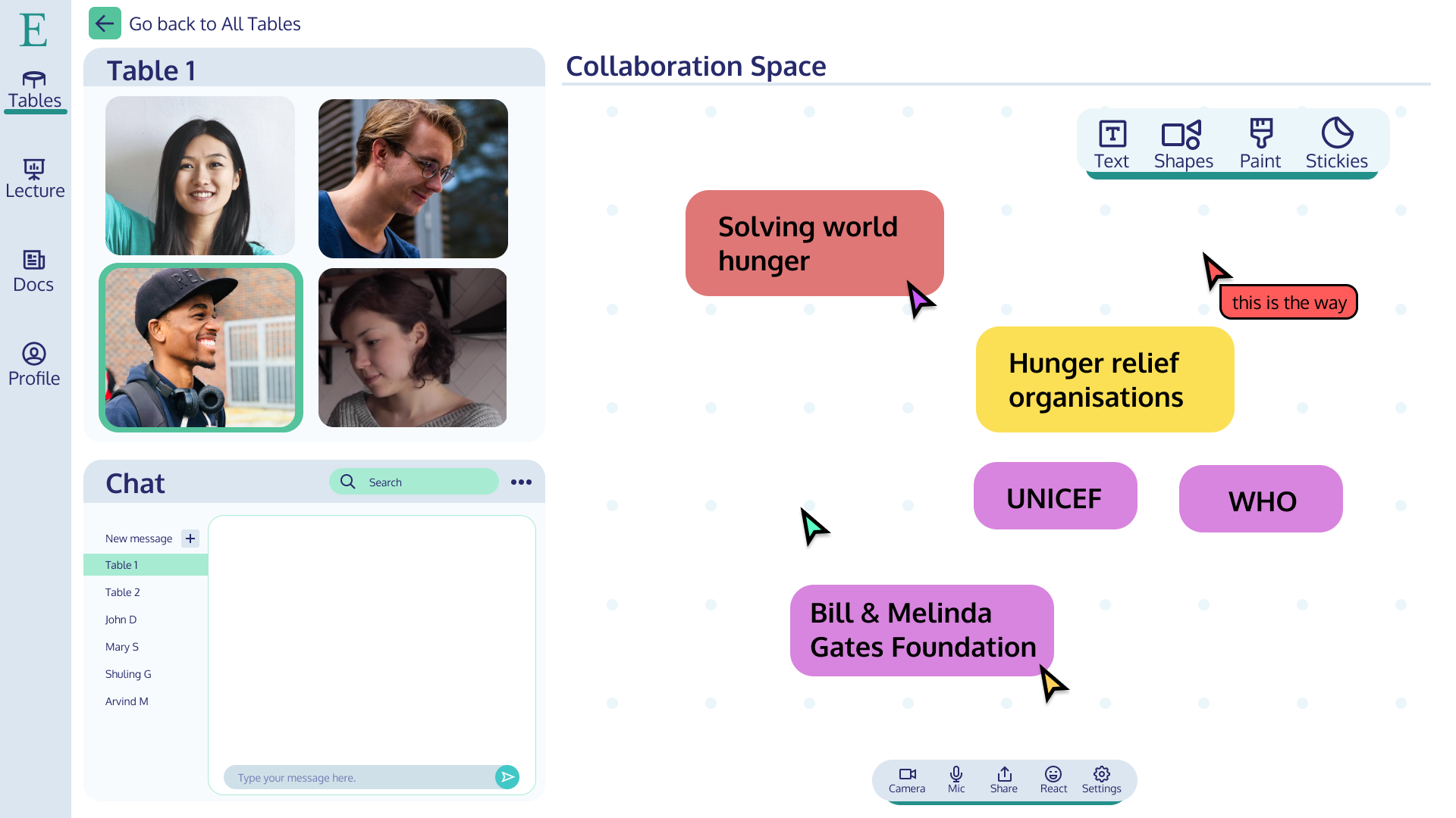
Inside the Table
The Collaboration Space is a shared whiteboard where each table member can contribute.
Being able to see what other people are working on at the same time encourages collaboration and exchange of ideas.
The whiteboard has 4 features: creating a text box, drawing a vector shape, using a paint tool to draw with your mouse, or creating a sticky note.
Teachers can also view the whiteboard from the main Table view, so they always have a birds-eye view of the classroom work.

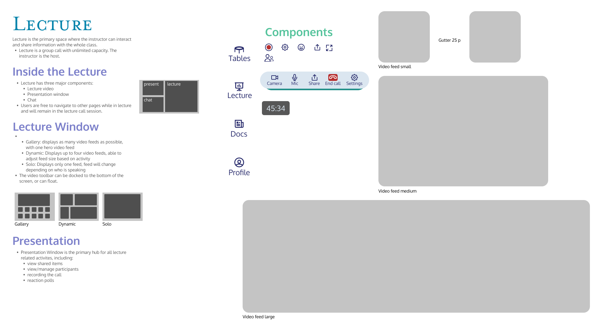
Lecture
This is where the teacher can interact with the whole class.
There are three view styles for the lecture, Gallery, Dynamic, and Solo.
In the Presentation window, teachers have controls to mute participants, record the lecture, start a public opinion poll, and adjust their screen share.

Documents
For file management and course information.
This is where teachers can upload, edit, and grade assignments, as well as manage recordings, and upload additional materials for the class (reading chapters, slides, external links, etc.)
For students, this is where they can access all the information that the teacher has posted for the course. What’s even better, all the courses are included in one place.
What I’ve learned
Projects grow exponentially fast. Keep it focused!
When we started interviewing users about their issues with current tools, our team had a ton of ideas about how to build a better solution. But too many ideas leads to an unfocused project with a cluttered view and poor scope. Many meetings were held to talk about scale and scope and if we had been more deliberate about the focus and scope of the project from the beginning, our designs would have benefited both in terms of direction and time-efficiency.
Simple designs are the key to clear communication
Our audience was asking for clear communication, but our designs got in the way of our message. There were too many buttons, too many screens, and too many options. In the end, I pruned everything down and made sure the key features were highlighted in simple and minimal designs so that the core concepts were immediately apparent for users. It’s easy to get lost building a product with 100 different options that can do 100 different things, but its much harder (and more rewarding) to build a product that can do one thing exceptionally well for my target user.